Amasa
A re-designed site for a new beginning
Amasa is a San Diego based marketing agency, focused on providing full funnel services to their clients in order to grow their business and create loyal customers, using a combination of creative and paid media expertise to maximize the brand's profitability and reach their goals.
Client
Amasa
Completed
2021
Role
UI/UX Design
Project Link

The Mission
The goal was to re-design their website using the current branding, while incorporating new interactive elements throughout the layout, making it easier for potential clients to navigate and learn about Amasa and their services. With the newly acquired badge of "Fastest Growing Agencies of 2021" the objective was to show potential customers that Amasa, although small in size, was big enough to compete with the best agencies in the country.
Conceptualization
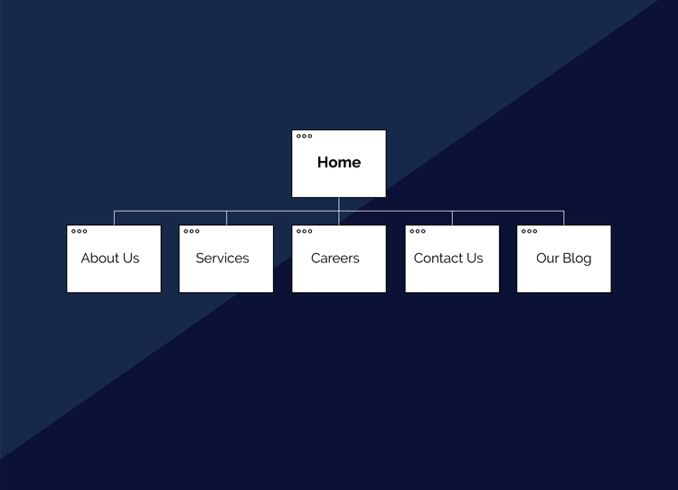
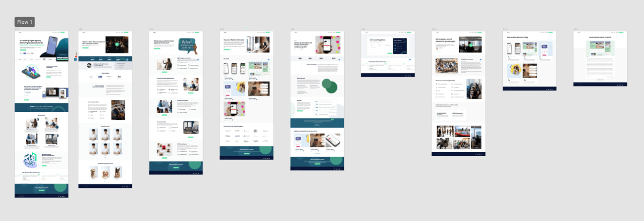
The first thing I did was create a site map, that would allow me to define the structure of the website before any design work started. This prevents time and/or resources from being wasted. After completing the site map, the next step was to make a rough sketch of each page, defining the sections and content that was needed to build out the low fidelity wireframes.
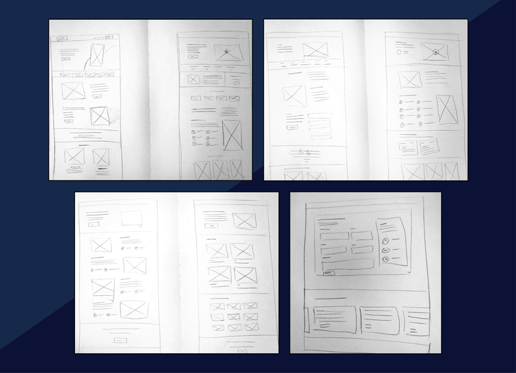
Low Fidelity
Using the sketches that were based off of the site map, low fidelity wireframes were created, and presented to the stakeholders to confirm that the structure and layout of the website was in line with their vision for this project.
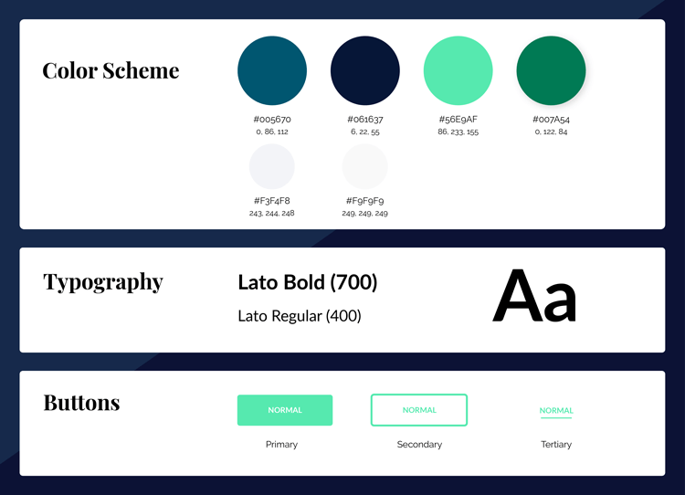
Style Guide
As with most other web design projects I've worked on, I like to create a visual guide that contains every style, font, and color that can be used for the final design, these tend to be as simple or as complex as the brand itself, but very helpful as they help me keep in line with the brand guidelines trhoughout the design process.
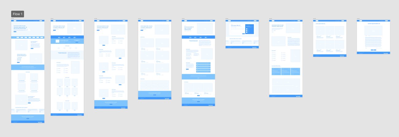
Implementation
Using the previously mentioned style guides, all the assets, elements, graphics, and content were created and implemented in the high fidelity wireframes, which then, were turned over to the stakeholders for further review before the development process started.
First Impressions
We decided to add a couple of moving elements to the home page in order to catch the users attention. These elements push the user to look at the animations, that's why we decided to make these parts the hard hitters. The animated text was meant to show the potential customer that no matter how big or small their business is, Amasa is the best agency for them. And as for the animated video, the idea was for the user to see what the creativer departmen is capable of, and all the different platforms they can promote their business or product on.
You Need It, You Got It
A simple but elegant solution was created to display the different platforms Amasa uses to promote their clients. Every client has different needs. Thats' why we wanted to show versatility with this component. Any social media platform, any device, any format.
Look Here...
Multiple animated banners and CTA's can be seen throghout the website. The best way to make someone look at something, is to make it move. That's why we decided to use these aimations in strategic places.
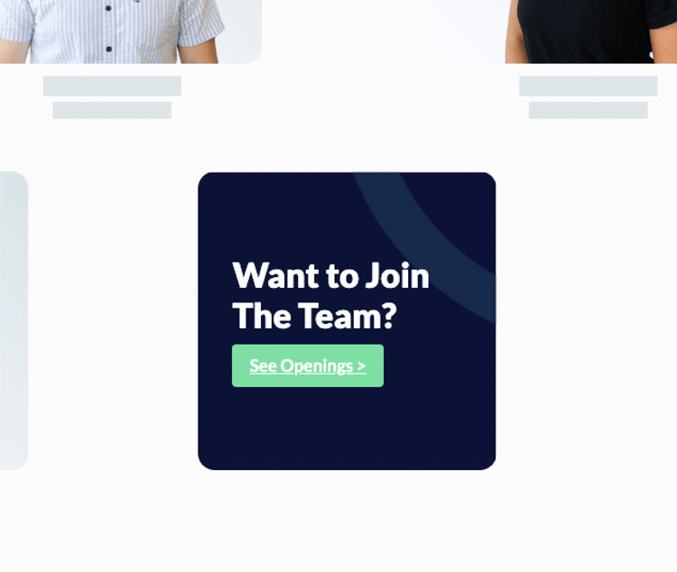
One Of Us
As a growing agency, the need to add more talent is evergrowing. We thought that a very innovative way to promote this was to make any potential employee visualize themselves as a team member. Thats why the last card in the "Meet the Team" section is an invitation to apply. That way the user feels like that "team card" could be them.
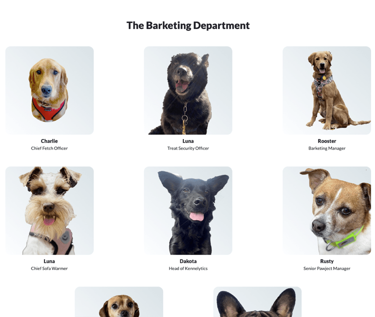
The Barketing Department
Nothing says we're a fun and easy-going company like being pet friendly, right? Thats' why we decided to add "The Barketing Department" showcasing the furry friends from current employees. A litle bit of humour here and there never hurt anybody, so the question was, why not?