Memphis In May
A re-imagined website to create a memorable experience.
Memphis in May is an international festival whose main purpose is to promote and celebrate Memphis culture, foster economic growth, and enhance international awareness through education. They host the city’s largest events like the Beale Street Music Festival and the World Championship Barbecue Cooking Contest. Memphis in May also produces extensive education, international, and economic programs for the city.
Client
Memphis In May
Completed
2021
Role
UI/UX Design
Project Link
The Mission
Designing and developing a website that encapsules all 4 events of the Memphis In May festival. We were tasked with re-designing an out-of-date website using the most recent web practices and aesthetics, as well as making it intuitive enough for older people to use, the biggest challenge was unifiyng their 4 events under a single banner, while making it easy to edit in case the organizers needed to make changes in the future.
Conceptualization
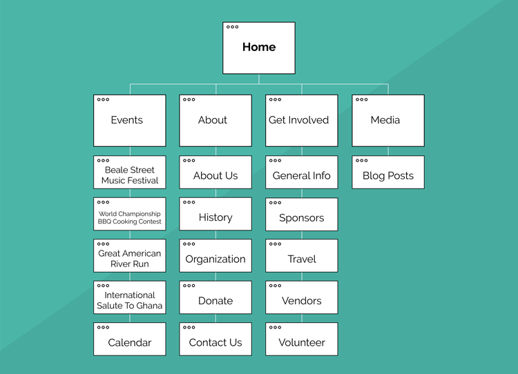
For this project there were a lot of stakeholders involved, so every decision had to be double checked, from the creation of the site map and deciiding which pages to keep, to the rough sketches. Every single detail of the process from beginning to end was meticulously planned.
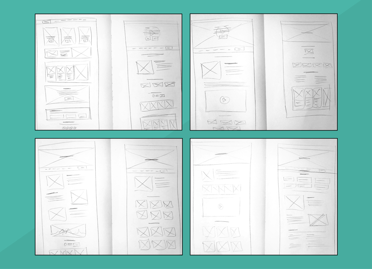
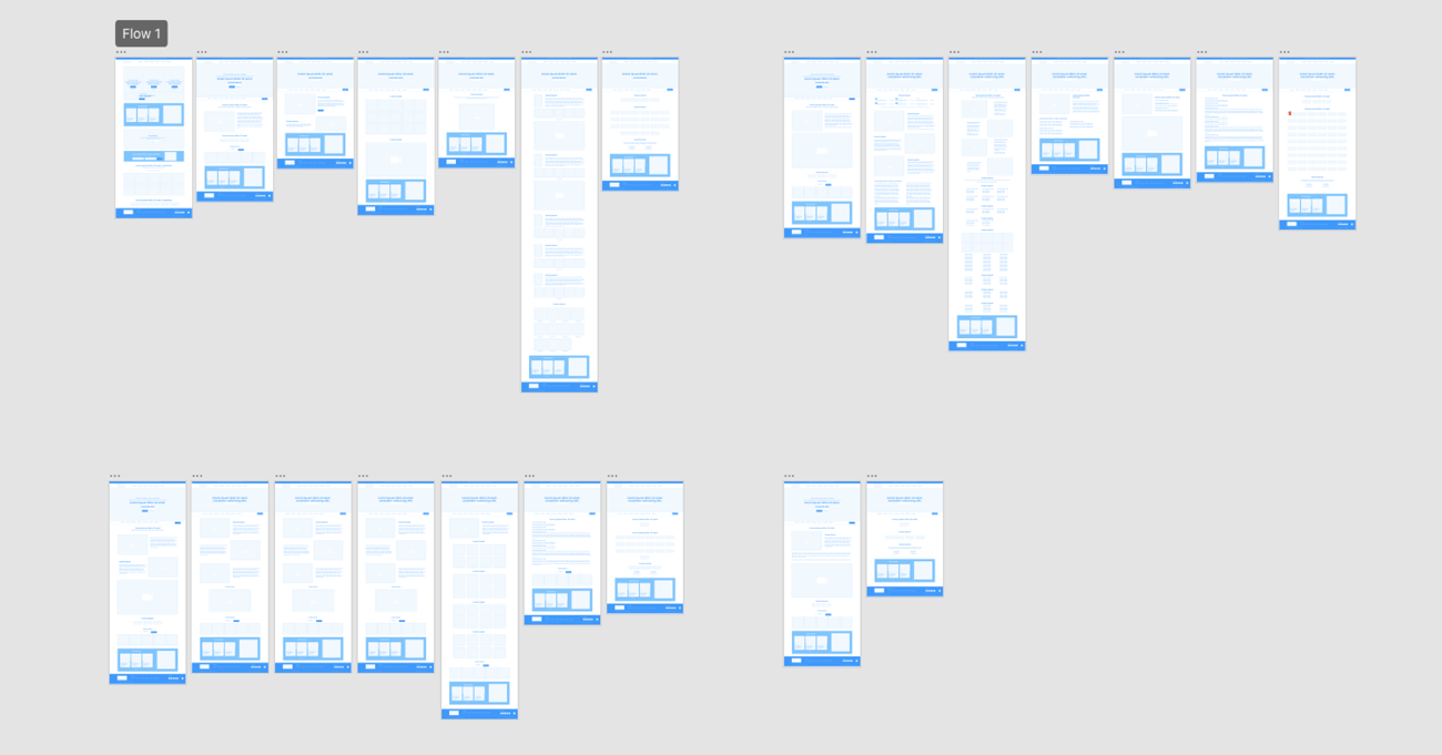
Low Fidelity
In order to make an aesthetically pleasing website, as well as making it easy to update, we decided to templatize the design. That way a lot of the pages would be similar in layout and structure, varying just the information within them. This made it easier to create low fidelity wireframes since a lot of the elements were repurposed throuhgout the pages.
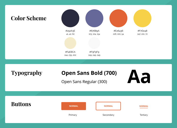
Style Guide
Even though the events had different logos and colors, we decided to unify every visual aspect in this website under the Memphis In May brand, using their colors, fonts, and visual elements throughout every single page.
Implementation
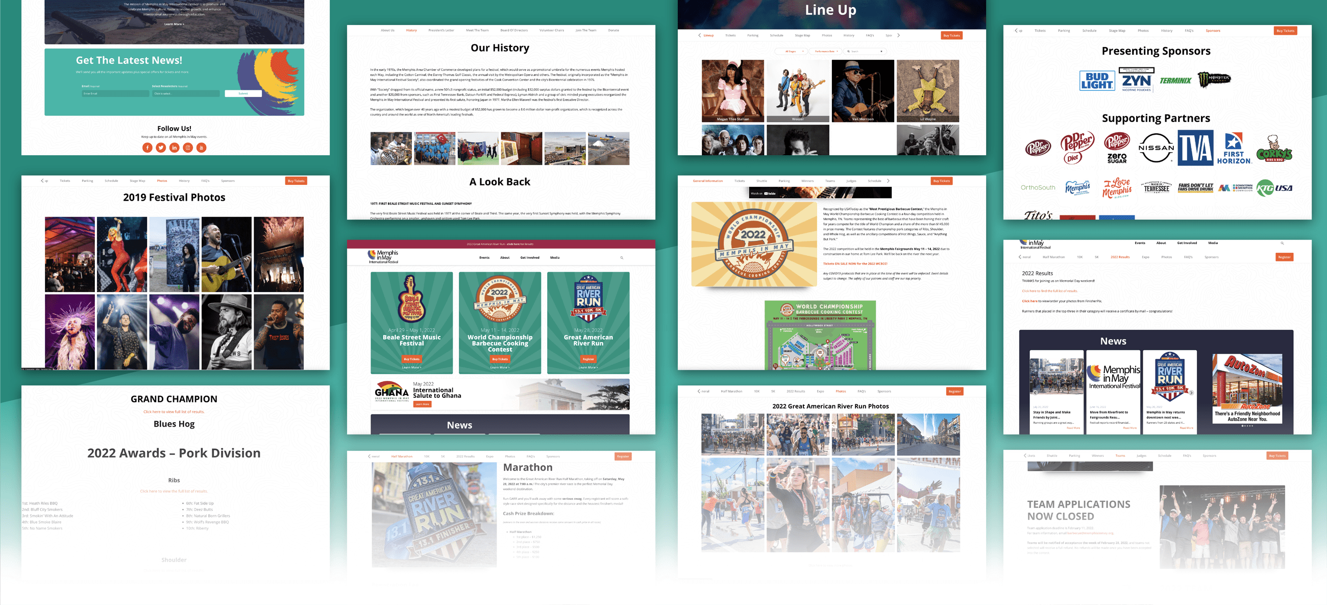
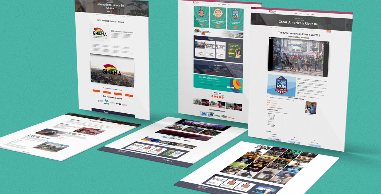
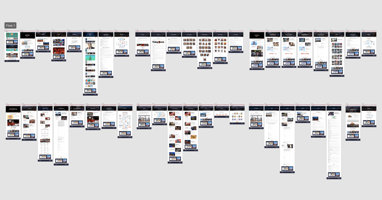
Using Memphis In May's guidelines and assets, I designed a brand focused high fidelity wireframe. As you can see, a lot of the pages look very similar. This is because we tried to make them all follow a specific structure so the layout can be easily updated in the future without much hassle. The reason this wireframe contains more artboards than the low fidelity wireframe is because the stakeholders wanted to see as many pages as they could fleshed out before giving the green light to start development. I eneded up having to design 50+ high fidelity artboards.
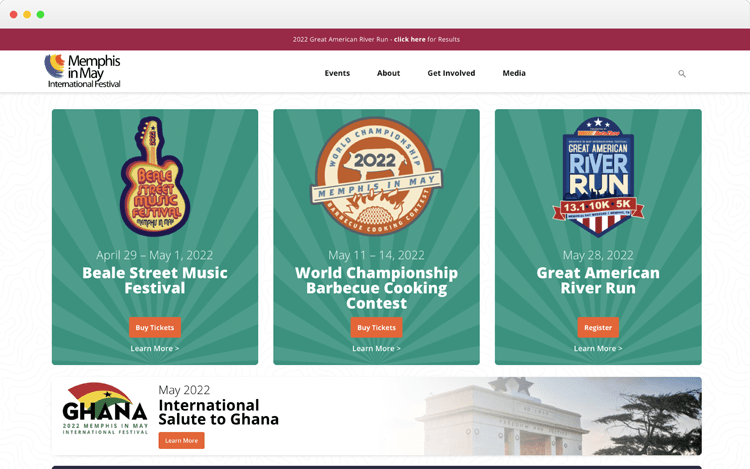
Event Focused
It was very important for the event organizers to have all 4 events be visible as soon as you enter the page. That's why we created this layout. Each event is easily identifiable with their respective logos, dates, and a quick access to buy tickets or read more about them. All the information you need can be found above the fold.
Filling The Gaps
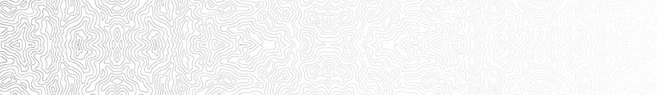
One thing the stakeholders were'nt very fond of was all the use of white space. They felt we could do something with it, so we decided to create a texture to incorporate as a background throughout the website. Subtle enough that it won't be intrusive, but clear enough to know the space is not empty. Using some kind of topography image was a suggestion that was discussed with the team and the stakeholders.
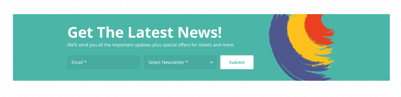
Targeted Subscritions
Each event that Memphis In May hosts requires a lot of information. That's why we decided to create a unified newsletter subscription component, where the user can easily choose which event they are interested in and only receive emails regarding the ones selected.
Event Sneak Peeks
As mentioned before, every page has a similar layout and structure to an extent and in order to make each one of them unique we, decided to use specific event assets for each of the pages. The most obvious defining element being the videos in the hero sections of each event main page. As soon as you go into any event page you'll be greeted by a hero section containing the name, date, and a video background where you can see the event from previous years – a sneak peek of what you're in for.
Unique Navigation
The navigation for this site was quite the challenge. We had to have the main website navigation bar, while each event also required it's own navigation bar containing several pages. We didn't want to mess with the main navigation so we decided to create specific sticky menus for each event that would only appear once you went into one of them. These menus contain multiple pages, specific to each event. Once the user reaches a certain point while scrolling down, the menu stays sticky to the top. That way the user always has access to it no matter how far they scroll.
Additional Screens
As you can see in the high fidelity section of this page, the resulting wireframe contained 50 plus artboards. Here are just a few other designs showing some of the elements used throughout the website.